Theory, Made Useful Explainer 3 - When Means Don't Mean a Thing
When chasing the mean leaves your job performance below average

Part of the “Theory, Made Useful” Series - Explainer 3
In this article, we’ll cover:
- How to spot differences that look big but aren’t statistically meaningful using Seaborn bar plots
- Aggregated function and group by in Pandas
- Important business KPIs and concepts: Returning Customers Ratio, Stickiness, Loyalty, and Engagement
- How to plot an interactive bubble chart with Plotly
The FoodHub dataset (yes, FoodHub, not that other Hub…) is a classic example of a data trap. Many analyses floating around on GitHub and Kaggle stop at surface-level comparisons of means and totals across categories. And that’s fine - in fact, for a course exercise in EDA, it’s enough to get you an A+ or a 100%.
But here’s the catch: in a real business context, this same approach quickly turns into bad practice. Why? Because the visible differences often vanish once you dig one layer deeper. What looks like a clear signal in descriptives may have no statistically significant effect, and acting on it in the real world can lead to wasted resources and wrong decisions.
In this case, FoodHub is portrayed as a food-delivery aggregator in New York. Customers place restaurant orders, delivery partners pick them up, and the company earns a margin on each transaction. The dataset includes variables like cuisine type, order cost, weekday vs. weekend, ratings, prep time, and delivery time.
On the surface, it tempts analysts to jump to quick conclusions, such as:
- American, Japanese, and Italian cuisines are the most popular.
- Increase the number of vehicles around popular restaurants, especially on weekends when delivery times are longest.
- Promote cuisines with higher average order cost.
All of which sound reasonable - but without statistical depth, these insights are more illusion than strategy.
Let’s explain
A closer look at the numbers behind the charts would reveal that the differences we see are a pitfall. How come?
Lets plot with Seaborn:
1
2
3
4
5
6
7
8
9
10
11
12
13
14
import pandas as pd
import seaborn as sns

# Just setting the order
order = df.groupby('cuisine_type')['cost_of_the_order'].mean().sort_values(ascending=False).index

# Plot
sns.barplot(data=df, x='cuisine_type', y='cost_of_the_order', hue='cuisine_type', order=order)
plt.ylabel('Mean Cost')
plt.xlabel('Cuisine Type')
plt.xticks(rotation=45, ha='right')
plt.tight_layout()
plt.title('Mean Cost of Order by Cuisine Type')
plt.show()
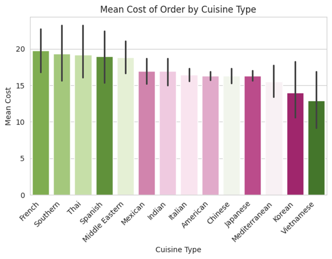
Let’s look at this plot: mean order cost by cuisine. Are Vietnamese and Korean really cheaper? Is Spanish more expensive? At first glance, it seems so. But a closer look at the data shows there are too few restaurants in these categories to draw meaningful conclusions. That’s the law of small numbers at work - and it leads to flawed statistical reasoning, which in turn leads to flawed business decisions. In other words, bad stats can cost the company money.
When we aggregate means by category, sns.barplot gives us a built-in warning: the black lines extending from each bar. These are confidence intervals - a tool that provides a safety margin around our estimate. Instead of reporting a single number, they define a range: “I’m fairly sure the true value lies somewhere between here and here.”
Now, look at the overlaps between the confidence intervals across cuisines. Even when two bars don’t overlap much, ask: how large is the actual difference? And more importantly - how would it translate into real dollars earned after making a pricing or strategy change?
Other common fallacies in the Foodhub datast
Many might conclude that increasing the fleet on weekends or around popular restaurants would solve the problem. But how effective would that really be? A closer look at the data shows no significant difference in customer satisfaction (CSAT) across delivery times. In other words, delivery speed isn’t what’s bothering FoodHub users.
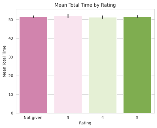
Further more, even when binarizing the total delivery time to ‘Over 60 Mins’ and ‘Under 60 Mins’ the rating is not changing significantly
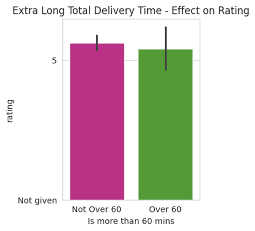
Which variables or categories did show differences significant enough to impact business? Spoiler: None.
What can we conclude then?
One striking business problem revealed by the data is that FoodHub suffers from a severe loyalty issue. Most users place just one order and never return. In real-world business, churn and loyalty are critical concerns - and here the numbers look alarming.
We’ve already seen that cuisine type and delivery times don’t explain the difference. So what else could it be? Think about your own behavior: why do you return to your favorite restaurants? Is it because they’re Chinese or French? Do you literally stand at the door with a stopwatch to measure delivery time? Probably not. For most of us, the main decision rule is simple: how much we enjoy the food.
And that’s the crux of it. FoodHub has a loyalty problem - only 34% of users placed more than one order.
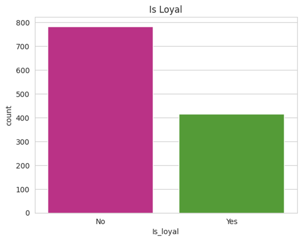
How can we address this problem? We already saw that factors like cuisine type and delivery times don’t explain the difference. Perhaps the answer lies within the restaurants themselves - independent of cuisine, delivery speed, or other variables in the data.
Churn & Loyalty by Restaurant
First, let’s define a KPI for each restaurant: Returning Customers Ratio - the ratio of total unique customers to total number of orders.
- A value of 1 is the lowest: it means no customer ever placed a second order. These are the “App-User Burners.”
- Higher values indicate more repeat customers, reflecting stronger loyalty and engagement. These are the “Loyalty Generators” - restaurants that build stickiness and long-term customer value.
How to?
1
2
3
4
5
6
7
8
9
10
11
12
13
14
import pandas as pd

# Grouping # orders and # unique customers by restaurant
df_grouped = (
    df.groupby('restaurant_name')
    .agg(
        num_orders=('order_id', 'count'),                # Counting number of orders
        num_unique_customers=('customer_id', 'nunique'), # Counting unique customers
    )
    .reset_index()
)
# Creating the calculated column # orders / # unique customers
df_grouped['returning_customer_ratio'] = df_grouped['num_orders'] / df_grouped['num_unique_customers']
df_grouped = dfres2.sort_values('returning_customer_ratio', ascending=False)
Often the analysts get a task - calculate revenue based on a given pricing index.
Let’s assume the app charges the restaurant 25% on the orders over $20 and 15% on the rest of the orders:
1
2
3
4
5
6
7
8
9
10
11
12
13
14
15
16
17
18
19
20
21
22
23
24
25
import pandas as pd

# creating colums using lambda expression to calssify order charge in %
df['charge'] = df['Is more than 20$'].apply(lambda x: 0.25 if x == 'Yes' else 0.15)
# %charge * $ Price = $ Revenue
df['net_revenue'] = df['cost_of_the_order'] * df['charge']
net_revenue = df['net_revenue'].sum()
print(net_revenue)

# Updating the aggregated df:

df_grouped = (
    df.groupby('restaurant_name')
    .agg(
        num_orders=('order_id', 'count'),                # Counting number of orders
        num_unique_customers=('customer_id', 'nunique'), # counting unique customers
        total_revenue=('net_revenue', 'sum'),            # adding revenue to our aggregated-by-restaurant data frame
        cuisine=('cuisine_type', 'first')
    )
    .reset_index()
)

df_grouped['returning_customer_ratio'] = df_grouped['num_orders'] / df_grouped['num_unique_customers'] # Creating the calculated column
df_grouped = dfres3.sort_values('returning_customer_ratio', ascending=False)
dfres3.head()
Now lets visualize!
Let’s build an interactive bubble chart that maps restaurants across three metrics: total revenue, returning-customer ratio, and total number of orders.
1
2
3
4
5
6
7
8
9
10
11
12
13
14
15
16
17
18
19
20
21
22
23
24
25
26
27
28
29
30
31
32
33
34
35
36
37
38
39
40
41
42
43
44
45
46
47
48
49
50
import pandas as pd
import matplotlib.pyplot as plt
import seaborn as sns

# Filter data for restaurants with more than 5 orders
df_grouped = df_grouped[dfres3['num_orders'] >= 5].copy()

# Setup figure and axes
fig, ax = plt.subplots(figsize=(12, 6))

# Plot
sns.scatterplot(
    data=df_grouped,
    x='total_revenue',
    y='returning_customer_ratio',
    hue='cuisine',
    size='num_unique_customers',
    sizes=(40, 1000),
    alpha=0.9,
    palette= [
    "#e01c8b", "#e062b2", "#4dac26", "#f7c9e5",
    "#fde9f3", "#f6f6f6", "#e4f6dc", "#ccebb5",
    "#a8db8f", "#e6c95d", "#b01c8b", "#e062b2"
],
    ax=ax
)

# Log scale axes
ax.set_xscale('log')
ax.set_yscale('log')

# Labels and title
ax.set_title('Restaurants: Revenue vs Returning Customer Ratio')
ax.set_xlabel('Total Revenue (log scale)')
ax.set_ylabel('Returning Customer Ratio (log scale)')

# Legend
ax.legend(
    bbox_to_anchor=(1.05, 1),
    loc='upper left',
    borderaxespad=0,
    title='Cuisine',
    fontsize='small',
    title_fontsize='medium'
)

# Save and display
plt.tight_layout()
plt.savefig('seaborn_scatter_fixed.png', dpi=300, bbox_inches='tight')
plt.show()
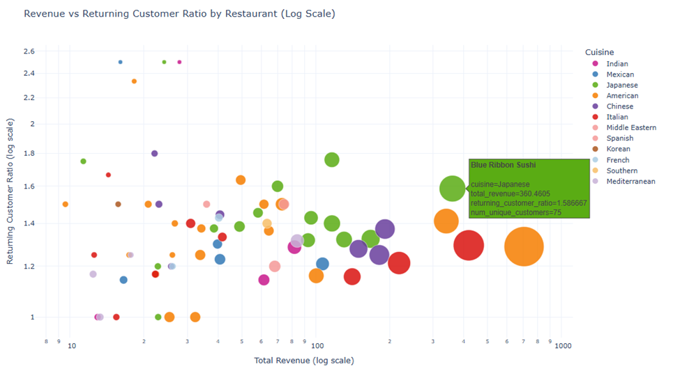
Please note that the X and Y axes are in log. The differences are higher than they seem.
From this chart we can conclude:
- The Restaurants on the far right are “Money Makers”
- The Restaurants on the far high right are both “Money Makers” and “Retention Generators.” For example, Shick Shack drives high revenue, but its returning-customer ratio is only ~1.3. Blue Ribbon Sushi, on the other hand, generates less revenue but has a higher returning-customer ratio of ~1.6. That makes it especially valuable, as it boosts recurring usage and overall app stickiness.
- The Restaurants on the very upper part - Y = 1.8 and above, are not true “Money Makers” but they make “Emerging Stars”. With this retention rate they can make a real growth engine for the app.
- The restaurants at the bottom are “Churn Drivers” - customers who ordered from them never came back. The counterintuitive part is that the bigger and further right the bubble, the more revenue and customers those restaurants had. At first glance, this might look “good for the business,” but in reality it means they exposed more customers to a bad experience. In other words, they may have caused more damage than benefit.
- We also see a green cluster in X > 100 and Y > 1.3, with 5 green bubbles in Y=1.6 and above. This means that Japanese Cuisine is on the rise and suitable for the app audience.
You can find the full code notebook and data set on my GitHub Repo (MIT License)
You can follow me on LinkedIn
Originally published on Medium.