Theory, Made Useful Explainer 2 - Explaining PCA Like a Hollywood Casting Director
A fun visual guide to Principal Component Analysis using movie stars and screen chemistry

Part of the “Theory, Made Useful” Series - Explainer 2
In this article, we’ll cover:
- What is PCA? An intuitive explanation without heavy linear algebra
- How to run PCA: Simple, beginner-friendly code snippets
- Three common uses: Dimensionality reduction; noise reduction and signal extraction; and visualization and clustering pre-step
- Explained variance: How to visualize it by principal component
- The unexpected use: PCA for business domain orientation and exploratory data analysis (EDA)
- How to read a PCA loading heatmap
What is PCA?
When people hear Principal Component Analysis (PCA), they often think of it as a fancy way to “reduce dimensions.” That’s true but it’s only one of its uses. PCA is better understood as a technique for finding new uncorrelated axes (principal components) in the data, ordered by how much variance they capture. This can then be used for dimensionality reduction, but also for visualization, noise filtering, or exploratory analysis.
Our datasets usually include many variables that are correlated with each other, to a greater or lesser extent. Grasping the full interactions and choosing where to look at what is important in a huge matrix of rows and columns is impossible.
PCA prioritizes the angles - or perspectives - that capture the most variation in the data with the fewest dimensions.
What PCA Does?
Each dataset has a covariance matrix. This covariance matrix is a square matrix that shows how any of the variables in the dataset vary together. Or, in other words, it quantifies not only the spread of each individual variable (its variance) but also the direction and strength of the relationships between every pair of variables.
And why is this important? Because our principal components are simply vectors in this matrix, or more precisely, eigenvectors of this matrix.
Since the principal components are orthogonal directions in the covariance matrix, the projections of the data onto them (the component scores) are uncorrelated.
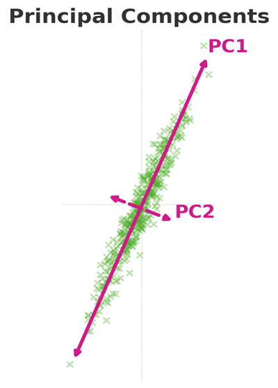
In the diagram below we can see a 2D distribution, in which PC1 is the vector that captures most of the variance and PC2 is the second orthogonal best.
A more intuitive explanation
Even if we did not understand a word from the explanation above, it should not deter us. Take me for example. I have no idea how internal combustion engines work, but I manage, somehow, to drive my way to work a couple of times a week, sometimes, even without accidents.
Just like when you’re driving, it is more important to read the road and feel when the engine struggles, rather than know how ICE or lithium battery works. The same goes for PCA: what’s crucial is interpreting the outputs and linking them to the subject matter - not digging into the deepest layers of linear algebra behind it.

Take these cars for example. Imagine each car in this picture is a data point in our dataset. Each has features like color, style, grill shape, length, windows, etc.
PCA helps us find the best angle from which we will capture most of the variance between them.
- From the profile angle, we clearly see the difference in length and the number of windows, as well as the correlation between length and the distance between the front and rear wheels.
- From the front angle, we can capture the variance in width, the correlation between width and the axle, and the front windshield shape.
PCs are like such angles through which we look at the covariance matrix, and each angle captures a certain amount of variance from the combination of all variables at once. How much? As we all remember from our beloved linear algebra classes, each vector has a value, and each eigenvector has an eigenvalue. Each eigenvalue tells us the amount of variance in the dataset captured along its eigenvector direction. Dividing by the sum of all eigenvalues gives the proportion of variance explained by each component.
Key Takeaway
PCA doesn’t delete variables like VIF or “drop columns with redundancy.” Instead, it builds a new coordinate system, where each axis captures a unique slice of variation in your dataset.
Code Sample - PCA Explained Variance visualized
Here’s a minimal example in Python:
1
2
3
4
5
6
7
8
9
10
11
12
13
14
15
16
17
18
19
20
21
from sklearn.decomposition import PCA
from sklearn.preprocessing import StandardScaler
import numpy as np, pandas as pd, matplotlib.pyplot as plt
from matplotlib.ticker import MultipleLocator

# PCA
k = min(17, X.shape[0], X.shape[1])  # cap by samples/features
pca = PCA(n_components=k, random_state=1)
pcs = pca.fit_transform(X_scaled)
# Explained variance
exp_var = pca.explained_variance_ratio_
cum_exp_var = np.cumsum(exp_var)
# Hybrid scree plot
fig, ax = plt.subplots(figsize=(10, 5))
bars = ax.bar(range(1, k+1), exp_var, label="Individual explained variance", color="#4dac26")
ax.step(range(1, k+1), cum_exp_var, where="mid", label="Cumulative explained variance")
ax.set(xlabel="Principal components", ylabel="Explained variance ratio", xlim=(0.5, k+0.5))
ax.xaxis.set_major_locator(MultipleLocator(1))
ax.legend(loc="best")
fig.tight_layout()
plt.show()
This code snippet results in a hybrid plot showing the individual explained variance of each PC (as % of total PCs variance), and the cumulative explained variance.
3 Common uses: Dimensionality Reduction; Noise Reduction and Signal Extraction; and Visualization and Clustering Pre-Step
In our dataset, the Hollywood Actors dataset*, the hybrid scree plot looks like this:
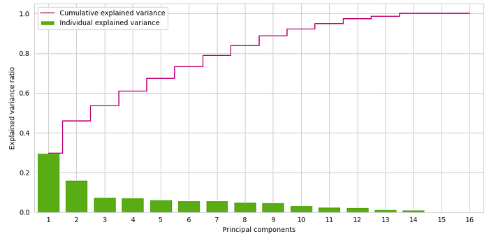
We have 16 PCs (as the number of variables, capturing 100% of the variance; however, the first 10 explain over 90% of variance. the last 6 explain very little, and may create noise.
In messy, high-dimensional datasets with dozens (or even hundreds) of variables, dimensionality reduction is often desirable - and sometimes necessary - to capture meaningful signal while cutting through noise.
Why? Because not all variance is useful. By downplaying or ignoring the variance from such features, we can focus on the variables that truly matter, strip away noise, and simplify the data in a way that highlights the strongest underlying patterns. The result: models that are easier to interpret and often more effective, because redundant or irrelevant information has been pushed aside.
For clustering, PCA often acts as a valuable pre-processing step:
- It reduces dimensionality while preserving the structure of the data.
- By removing noise and collinearity, it often makes clustering algorithms like K-Means or Hierarchical Clustering more stable and meaningful.
- It can speed up computation by eliminating redundant features.
Where do we draw the line?
There’s no universal cutoff for “how much variance to keep.” But as a rule of thumb, capturing at least 70-75% of the variance is usually considered safe. This balance ensures you don’t throw away too much information while still simplifying your dataset enough to make patterns clearer and models more efficient.
That said, there are exceptions: for visualization, we often settle for just two principal components, even if they explain only 40-50% of the variance, because the goal is not to maximize information but to make the data human-readable.
The Unexpected Use: PCA for Business Domain Orientation and EDA
Here’s where it gets interesting: PCA can also serve as a tool for business domain orientation - helping you grasp market dynamics and variable interactions during EDA.
PCA is used mainly for the purposes mentioned above; however, some will find it very useful for Business Domain Orientation and EDA, a crucial step before any data science project and in many business analytics projects.
In some cases it will bring us valuable grasp of market dynamics in variable interactions that we can can’t get easily form the popular heatmap, or busy-on-the-eye hued scatterplots.
How can we use PCA for this purpose? The first step is to create a PCA Loadings Heatmap.
Here’s a minimal example in Python:
1
2
3
4
5
6
7
8
9
10
11
12
13
14
15
16
17
18
19
# first 8 PCs over 90% of variance
pc_labels = [f"PC{i}" for i in range(1, 9)]

# sklearn: components_.shape = (n_components, n_features) with unit-length rows
# Correlation-style loadings = eigenvectors * sqrt(eigenvalues)
loadings = pca.components_.T * np.sqrt(pca.explained_variance_)  # (n_features, n_components)
#  making PC signs consistent - largest absolute loading is positive
for j in range(loadings.shape[1]):
    if loadings[np.argmax(np.abs(loadings[:, j])), j] < 0:
        loadings[:, j] *= -1
load_df = pd.DataFrame(np.round(loadings[:, :8], 2), index=subset.columns, columns=pc_labels)
def color_high(val):
    if val is None: return ""
    if val <= -0.25: return 'background: #d01c8b'
    if val <= -0.10: return 'background: #e78ac3'
    if val >=  0.25: return 'background: #4dac26'
    if val >=  0.10: return 'background: #91c848'
    return ""
load_df.style.format("{:.2f}").map(color_high)
Reading PCA Loading Heatmap
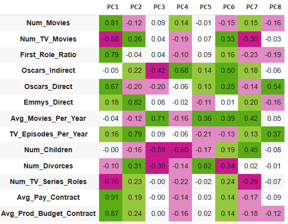
The loading value tells us the strength and direction of the relationship between the feature and that PC.
A high value tells us that the feature has bigger influences the PC, a positive value tells us that the feature moves in the same direction of the PC.
Since in PC1 Num_Movies loads positively and Num_TV_Movies negatively, we can conclude that PC1 is an axis separating “film-heavy” actors vs. “TV-heavy” actors.
A vertical look at all loads magnitude and directions, therefore, can reveal the following:
PC1 - Big-Screen Stardom (Movies, Pay, Budgets, Oscars, No-TV)
- High Positive Loadings: High number of movies, high pay, expensive productions, and many direct Oscars.
- Low Negative Loadings: Less TV appearances.
Positive with PC1 are the blockbuster movie stars with Oscars, high pay, prestige films that do not show much on the little screen.
A minute ago you saw cells with numbers on a PiYG background. Now you see Julia Roberts, DiCaprio, Meryl Streep, De Niro, Pacino to name a few
Business-wise: This is where the big money is.
PC2 - TV Prestige (Emmys, TV Episodes, Anti-Oscars)
- High Positive Loadings: Many Emmy awards and appearances on TV.
- Low Negative Loadings: Few Oscars.
Positive with PC2 are dominant TV actors, often Emmy winners, can appear on the big screen, but with less recognition.
Now you can read between the numbers: Bryan Cranston, James Gandolfini, Sarah Paulson and the list goes on…
Business-wise: This is a crucial backbone of the industry: individual productions and paychecks may be smaller, but their sheer volume makes them essential.
PC3 - High output, low prestige
- High Positive Loadings: Many movies per year, but not acclaimed. Few first roles and awards.
The Hollywood Proletariat. They will often be ‘the bad guy with the familiar face, that you saw many times but you don’t have a clue where.
Positive with PC3 are actors which their names will not tell you anything, but if you google their images you’ll say: “ahh, this guy”: William Fichtner, Clancy Brown, Danny Aiello, Eric Roberts, Michael Madsen…
Business-wise: These are the true workhorses of the industry - delivering solid value for money.
PC4 - Oscars by Proximity
- High Positive Loadings: Many “indirect Oscars” (films winning big without the actor holding the statue) and relatively few TV appearances.
This component highlights solid, reliable actors who appear again and again in ensembles of high-prestige films. You’ll often spot them in supporting roles in the works of directors like the Coen brothers. Think John Turturro, early Steve Buscemi, and Richard Jenkins.
Business-wise: they’re not in it for the business. They’re in it for the cinema.
Can you find your favorite actor in one of the PCs?
The Hollywood Actors dataset
Synthetic dataset generated by the author. Released under CC-BY 4.0 for reproducibility. The dataset aggregates fictional data regarding 300 movie and TV actors. Although fictional, the proportions and distributions of variables are mimicking real archetypes in the Hollywood Industry.
Hollywood Actors Dataset: Data Dictionary
- Num_Movies: Total number of movies acted in.
- Num_TV_Movies: Total number of TV movies acted in.
- First_Role_Ratio: Proportion of early career roles relative to the total.
- Oscars_Indirect: Count of Oscars associated indirectly (e.g., cast/crew wins).
- Oscars_Direct: Count of Oscars won directly by the actor/actress.
- Emmys_Direct: Count of Emmys won directly by the actor/actress.
- Avg_Movies_Per_Year: Average number of movies acted in per year.
- TV_Episodes_Per_Year: Number of TV episodes acted in per year.
- Num_Children: Number of children the actor/actress has.
- Num_Divorces: Number of divorces recorded.
- Avg_Pay_Contract: Average reported or estimated pay per movie role or a TV series season.
- Avg_Production_Budget: Average reported or estimated production cost per movie or a TV series season.
You can find the dataset on my GitHub Repo
You can follow me on LinkedIn
Originally published on Medium.