Based on a True Story Case 2 - Predicting the Present: How Time-Series Counterfactuals Reveal the True Impact of Business Changes
A Python-based guide to estimating impact using time-series counterfactuals in non-randomized settings.

Most business decisions never get a clean A/B test - yet executives still expect us to quantify the impact. This article shows how to measure real-world impact by predicting the version of the present we never got to observe.
What We’ll Cover
- Building a SARIMA time-series model in Python
- Calculating the difference between actuals and the SARIMA-based counterfactual in Python
- Why A/B testing and CausalImpact are often impractical in real-world business scenarios
- Framing the problem and solution in Microeconomics 101 terms for clearer economic and business intuition
The case you’re about to read is inspired by real events at an online-platform company. Certain field names, market verticals and operational details have been altered to protect sensitive information. Any resemblance to a real business case is not coincidental - because it is one.
Problem Definition: Assessing Business Impact Retrospectively
In many real-world business situations, we can’t run controlled experiments - the product team needs to ship now, the market just moved, or the platform simply can’t support parallel variations. Yet leadership still demands a clear answer: What was the impact? When the counterfactual world is unobserved, traditional period-over-period comparisons fall apart. In this article, we use a SARIMA-based counterfactual model to reconstruct the version of 2023 that should have happened if prices hadn’t changed - and measure the true economic impact hidden behind the raw YoY numbers.
Our Business Case Study: Fashion4Seasons
To illustrate the approach, I generated a synthetic but realistic weekly time-series dataset for an online fashion retailer called Fashion4Seasons. The dataset contains three years of weekly observations (Sunday-ending weeks) with just the essentials: Week, Revenue, and Quantity Sold.

In the first week of January 2023, right after the holiday dust settled and customers finished their annual spree of Black Friday, Cyber Monday, and last-minute Christmas shopping, the management of Fashion4Seasons made a bold, and, depending on who you ask, slightly capricious, move: they raised all prices by 10%.
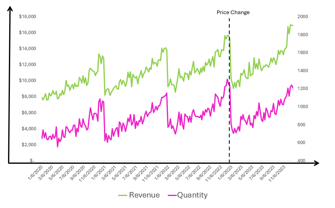
The timing wasn’t entirely irrational. After the promotions-heavy winter season, customers typically enter a quiet phase, browsing but not urgently buying. Management reasoned that if demand was going to dip anyway, they might as well use the lull to “reset” prices to a more profitable baseline. The official internal memo framed it as “strategic margin optimization.” The unofficial hallway explanation was closer to “Look, if Apple can do it every year, so can we.”
Was the move worthwhile? How can we tell?
The Micro 101 Explanation for the Approach
When we try to evaluate whether a price increase was worthwhile after the fact, we inevitably face one unavoidable challenge: we must estimate what would have been if the price had not been raised. That missing piece is our counterfactual.
Micro 101 gives us the classic intuition: If the price increases from P to P′, the demand curve intersects the new price at a smaller quantity Q′, and we compare the revenue rectangles P′-D′-Q′-O and P-D-Q-O to judge whether the move made sense.
But Micro 101 quietly assumes something that almost never holds in real life: that the demand curve stays fixed. In reality, demand shifts over time due to seasonality, marketing, product assortment, competition, and macro factors. Demand has moved from D Past to D Current, meaning the underlying demand at the same prices is simply not what it used to be.
A business analyst’s first instinct is usually to run a simple Period-over-Period comparison. In our dataset, that naïve calculation would show a modest growth of over 3% year-over-year in the year after the price change. In the illustration, this YoY comparison corresponds to the difference between the areas:
- P′-A-Q′-O (current actual revenue) versus
- P-B-Q_past-O (revenue from the comparable past period)
But is that the real impact of the price increase?
Short answer: No.
The true economic impact is the difference between:
- P′-A-Q′-O (current actual) and
- P-CF-Q-O (what revenue would have been at today’s demand curve and old price)
Or, since they have an overlapping area, simply the difference between rectangle i and rectangle c.
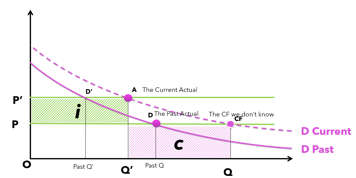
This second rectangle is hypothetical, because points CF and Q, the counterfactual price-quantity point, do not exist in the observed data.
That is where the idea of “Predicting the Present” comes in. We build a time-series counterfactual model that estimates the unobserved demand curve and tells us where CF and Q should be. Only by comparing the actual outcome to this modeled counterfactual can we isolate the true incremental impact of the price change.
The Solution: Using Time Series to Build a Counterfactual Scenario
In this section, we use a SARIMA time-series model to predict what Revenue and Quantity would have looked like throughout 2023. Because the model is trained exclusively on the pre-change period, its forecast represents a counterfactual scenario: what would have happened if prices had not been raised.
The next step is straightforward: we compare the actual post-change results against this counterfactual baseline to isolate the true impact of the price increase.
Lets Build the SARIMA Model for Revenue
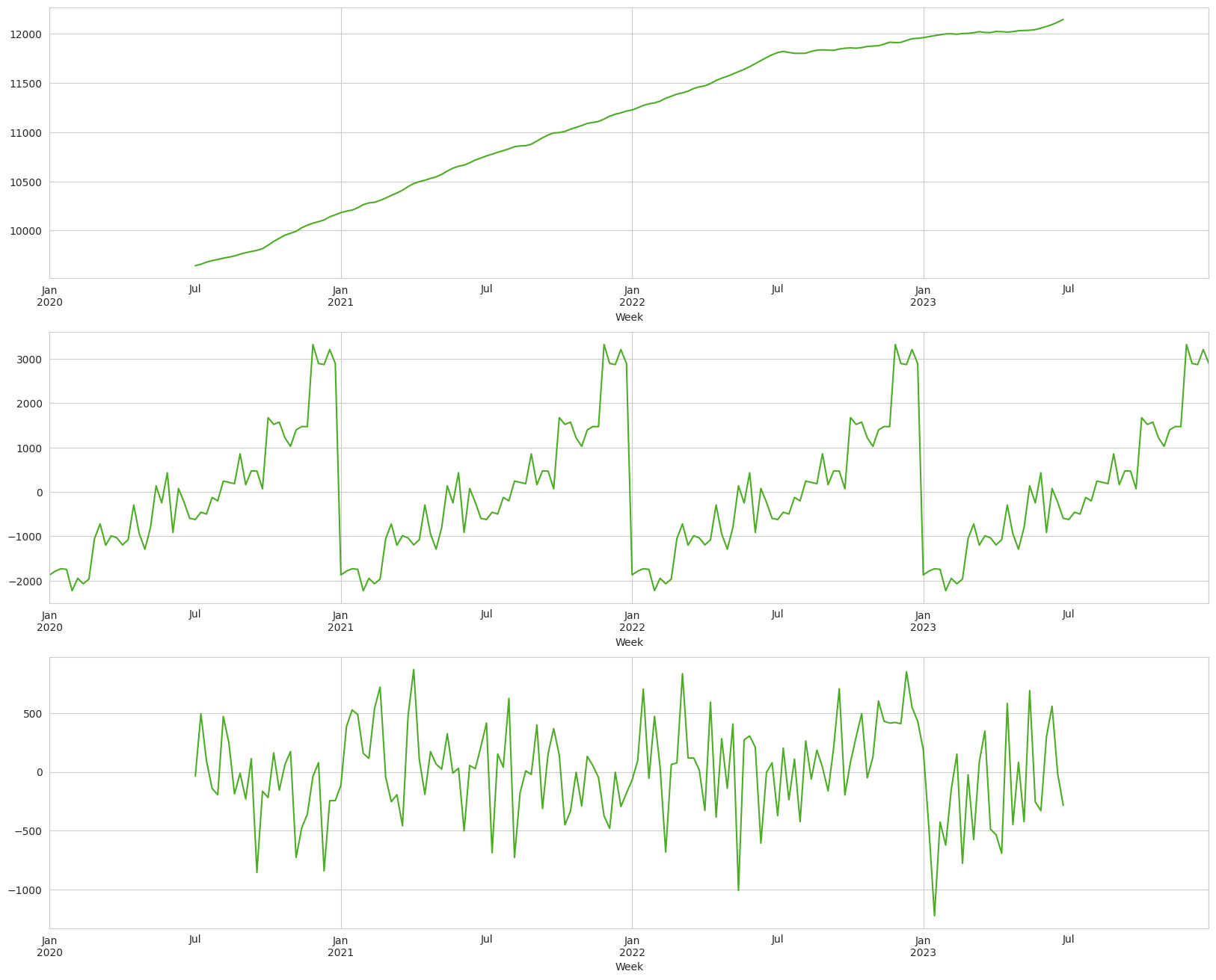
Decomposition: Trend, Seasonality, Noise
1
2
3
4
5
6
7
8
9
10
11
12
13
14
15
16
17
18
# Creating an empty dataframe to store the individual components
decomposed_data = pd.DataFrame()

# Extracting the trend component of time series
decomposed_data['trend'] = decomposition.trend

# Extracting the seasonal component of time series
decomposed_data['seasonal'] = decomposition.seasonal

# Extracting the white noise or residual component of time series
decomposed_data['random_noise'] = decomposition.resid

# Plot
fig, (ax1, ax2, ax3) = plt.subplots(nrows = 3, ncols = 1, figsize = (20, 16))

decomposed_data['trend'].plot(ax = ax1)
decomposed_data['seasonal'].plot(ax = ax2)
decomposed_data['random_noise'].plot(ax = ax3)
We observe a steady long-term growth trend in the top plot, clear and recurring seasonality in the middle plot, and moderate week-to-week fluctuations in the bottom plot, except every January, when revenue consistently collapses. Notably, the January 2023 drop is even sharper than in previous years.
Now we can define our periods. We have four years of weekly data, roughly 4 × 52 weeks. The price change occurred at the start of the fourth year. We’ll train the model on the first two years, validate it on the third, and, if the validation looks good (spoiler: it will, because the dataset was designed that way), we’ll use the full pre-change history to forecast the fourth year as our counterfactual.
1
2
3
4
5
6
7
8
# Using the first 104 weeks data as the training data
train_data = df['Revenue'].loc['2020':'2021']

# Using the next 52 weeks data as the test data
test_data  = df['Revenue'].loc['2022']

# Mark the change point from which the forecast begins
change_date = pd.Timestamp('2023-01-03')
Checking for Stationarity (and Fixing It When It’s Not)
A time series is considered stationary when its statistical properties, such as mean and variance, remain constant over time. In practice, many real-world time series are not stationary, so we need to apply certain transformations to make them suitable for modeling. One of the most common techniques is differencing: subtracting the previous value from the current value so that the model works with the changes rather than the raw levels. This often stabilizes the series and prepares it for models like SARIMA.
First we will check for stationarity
- We’ll use the Augmented Dicky-Fuller Test
- Null Hypothesis: The time series is non stationary
- Alternate Hypothesis: The time series is stationary
Checking for Stationarity
1
2
3
4
5
6
7
8
9
10
# Importing ADF test from statsmodels package
from statsmodels.tsa.stattools import adfuller

# Implementing ADF test on the original time series data
result = adfuller(train_data)

# Printing the results
print(result[0])
print(result[1]) # To get the p-value
print(result[4])
Result: 0.5258…
We reject the null hypothesis, and we can say the time series is non-stationary.
Let’s now take the 1st order difference of the data and check if it becomes stationary or not.
1
2
3
4
5
6
7
8
9
10
11
12
13
# Taking the 1st order differencing of the timeseries
train_data_stationary = train_data.diff().dropna()

# Implementing ADF test on the first order differenced time series data
result = adfuller(train_data_stationary)

fig, ax = plt.subplots(figsize = (16, 6))
train_data_stationary.plot(ax = ax)
plt.show()

# Printing the results
print('ADF Statistic:', result[0])
print('p-value:', result[1])
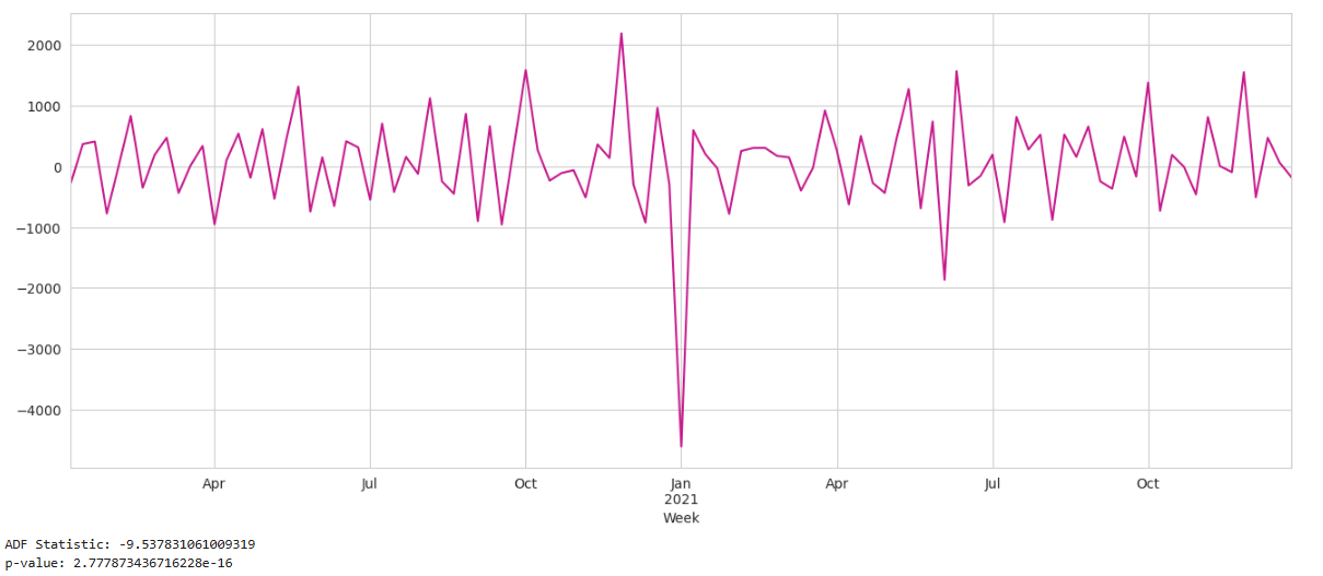
Great, the p-value is below 0.05, which means that after applying first-order differencing, the time series can be considered stationary. First-order differencing simply means Y't = Yt − Yt−1. Our d will be 1.
Autocorrelation Function and Partial Autocorrelation Function (a.k.a. Pinhead Plots)
The ACF and PACF help us understand how strongly the current value of a time series is influenced by its past values, and choose the right hyperparameters for the model: the Autoregressive p, Moving Average q orders for our SARIMA model.
ACF (Autocorrelation Function) Imagine each lag as a little “pinhead.” If the value at time t is very similar to the value at t-1, the ACF at lag 1 will be tall. If it resembles t-2 more than t-1, then the pinhead at lag 2 will be the taller one, and so on.
In short:
ACF shows how much all past lags correlate with the present.
PACF (Partial Autocorrelation Function) PACF goes one step further. It tells us how much each lag matters after removing the influence of the earlier lags.
In other words:
PACF tells us whether lag 2 truly adds information, or whether it only seems important because lag 1 is important.
Let’s Plot Them
1
2
3
4
5
6
7
8
9
10
# Creating two subplots to show ACF and PACF plots
fig, (ax1, ax2) = plt.subplots(nrows = 1, ncols = 2, figsize = (16, 6))

# Creating and plotting the ACF charts starting from lag = 1
tsaplots.plot_acf(train_data_stationary, zero = False, ax = ax1)

# Creating and plotting the PACF charts starting from lag = 1 till lag = 8
tsaplots.plot_pacf(train_data_stationary, zero = False, ax = ax2, lags = 8)

plt.show()
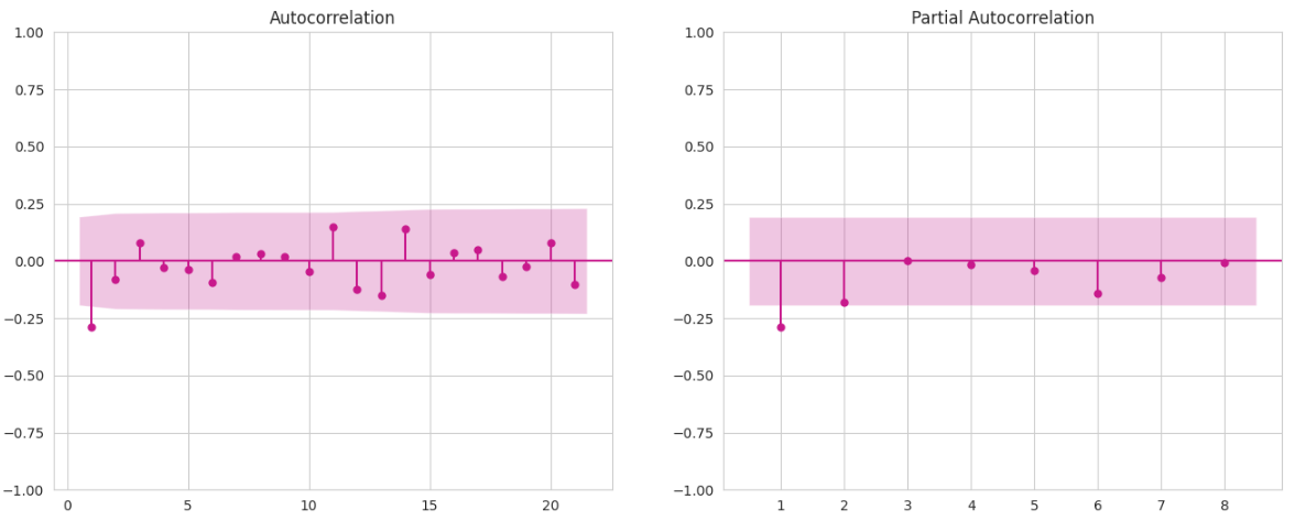
From the ACF plot, we see that after lag 1, all remaining pinheads fall inside the pink confidence band - meaning those lags are effectively noise. This suggests that the MA order (q) is around 1 though I’ll also try 0 and 2 in the grid just to be safe.
Similarly, in the PACF plot, only the first lag stands out, meaning the AR order (p) is also around 1 and I’ll also include 0 as a candidate.
Now we are ready to build the model:
1
2
3
4
5
6
7
8
9
10
11
12
13
14
15
16
17
18
19
20
21
22
23
24
25
26
27
28
29
30
31
32
33
34
35
36
37
38
39
40
41
42
43
44
45
46
47
48
49
50
51
52
53
54
import numpy as np
import statsmodels.api as sm
from itertools import product
from sklearn.metrics import mean_absolute_error

m = 52
d, D = 1, 1

p_vals = [0, 1, 2]
q_vals = [0, 1]
P_vals = [0, 1]
Q_vals = [0, 1]

def fit_and_score(y_train, y_valid, order, sorder):
    """
    Fit SARIMA(order, sorder) on y_train and return (result, MAE_on_valid).
    """
    try:
        model = sm.tsa.SARIMAX(
            y_train,
            order=order,
            seasonal_order=sorder,
            enforce_stationarity=False,
            enforce_invertibility=False
        )
        res = model.fit(disp=False)

        # forecast the validation window
        pred = res.get_forecast(steps=len(y_valid)).predicted_mean
        pred.index = y_valid.index

        mae = mean_absolute_error(y_valid, pred)
        return res, mae
    except Exception:
        return None, np.inf

cands = []

for p, q, P, Q in product(p_vals, q_vals, P_vals, Q_vals):
    order  = (p, d, q)
    sorder = (P, D, Q, m)
    # We have defined train_data & test_data in a previous snippet
    res, mae = fit_and_score(train_data, test_data, order, sorder)

    if res is not None and np.isfinite(res.aic):
        cands.append((mae, res.aic, order, sorder, res))

# pick model with lowest validation MAE
best_mae, best_aic, best_order, best_sorder, best_res = min(cands, key=lambda x: x[0])

print(f"Best MAE: {best_mae:,.0f}")
print(f"Best AIC (for that model): {best_aic:.2f}")
print(f"Best order:          {best_order}")
print(f"Best seasonal_order: {best_sorder}")
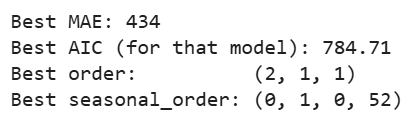
Now we will forecast the last period, evaluate our best model using quality metrics and visualize the model’s accuracy
1
2
3
4
5
6
7
8
9
10
11
12
13
14
15
16
17
18
19
20
21
22
23
24
25
26
27
28
29
30
31
32
33
34
35
36
37
38
39
40
41
42
43
44
45
46
47
48
49
50
51
52
53
54
55
56
57
58
59
from sklearn.metrics import mean_absolute_error, mean_squared_error

# Number of weeks in the validation (test) period
n_valid = len(test_data)

# Forecast the next n_valid steps from the fitted SARIMA model
pred = best_res.get_forecast(steps=n_valid)

# Point forecasts for the validation window
mean_valid = pred.predicted_mean

# Forecast confidence intervals (e.g., 95% by default)
ci_valid = pred.conf_int()

# Align forecast index to the actual test_data index
mean_valid.index = test_data.index
ci_valid.index   = test_data.index

# Convert actual and predicted to plain NumPy arrays (defensive flattening)
y_true = np.asarray(test_data, dtype=float).ravel()
y_pred = np.asarray(mean_valid, dtype=float).ravel()

# Validation Metrics

# Mean Absolute Error
mae = mean_absolute_error(y_true, y_pred)

# Mean Squared Error
mse = mean_squared_error(y_true, y_pred)

# Denominator for MAPE: avoid division by zero by replacing 0 with NaN
den = np.where(y_true == 0, np.nan, y_true)

# Root Mean Squared Error
rmse = mse ** 0.5

# Mean Absolute Percentage Error (ignoring any NaNs from zero-denominator cases)
mape = (np.abs((y_true - y_pred) / den)).mean() * 100

print(f"VALID  MAE={mae:,.0f}  RMSE={rmse:,.0f}  MAPE={mape:,.2f}%")

# Plot: how well the model predicts the pre-change period ----
plt.figure(figsize=(14, 5))

# Tail of training data, to give context before the validation window
plt.plot(train_data[-80:], label='Train (tail)')

# Actual revenue in the validation period (2022)
plt.plot(test_data, label='Valid (actual)')

# SARIMA forecast for the same period
plt.plot(mean_valid, label='Valid (forecast)', ls='--')

# Vertical line to mark the price change date (start of 2023)
plt.axvline(change_date, color='k', ls='--', label='Price change')

plt.title('Pre-change validation (weeks end Sunday)')
plt.legend()
plt.show()
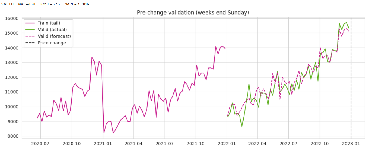
Key validation results
- MAE: 434
- RMSE: 573
- MAPE: 3.9%
So the model is only off by ~4% per week - which is fantastic.
A quick visual inspection shows that the gap between actuals and forecasts is minimal, and the model captures the seasonal revenue lift very well. At this stage, all figures are pre-change, so the goal is simply to minimize the error. Of course, before you praise me: I designed the dataset to behave nicely. I’m not here to impress Kaggle Grandmasters, I just want a clean example so I can prove a different point without ruining my weekend.
Now let’s compare our model against the naïve benchmark - the model that simply assumes next week’s value will be identical to this week’s (t+1 = t):
1
2
3
4
naive_forecast = test_data.shift(1)  # last week = next week
naive_mae  = mean_absolute_error(test_data[1:], naive_forecast[1:])
naive_rmse = mean_squared_error(test_data[1:], naive_forecast[1:]) ** 0.5
print(f"Naive MAE={naive_mae:,.0f}  RMSE={naive_rmse:,.0f}")
As expected, since I designed the dataset to behave nicely, the naïve model performs worse than our SARIMA model: MAE = 605, RMSE = 753, both higher than our SARIMA errors.
Final Step: Comparing Actual vs. Counterfactual
In this step, we compare the actual impact both in absolute dollars and relative to annual turnover. We also include a few safeguard checks to ensure we’re comparing the exact same periods. (And yes, since this post is based on a true story, these precautions aren’t just here to make the code look longer, if you catch my drift.)
Key idea: the counterfactual is not a forecast of the future - it’s a prediction of an alternate present
Now that we trust our model, we freeze time at the moment before the price change and ask: What would revenue have been if the price had stayed the same?
1
2
3
4
5
6
7
8
9
10
11
12
13
14
15
16
17
18
19
20
21
22
23
24
25
26
27
28
29
30
31
32
33
34
35
36
37
38
39
40
41
42
43
44
45
# Split pre/post
y_pre_change = y.loc[:change_date]
y_post = y.loc[change_date + pd.Timedelta(weeks=1):]

# Fit the model ON pre-change only
model_cf = sm.tsa.SARIMAX(
    y_pre_change,
    order=best_order,
    seasonal_order=best_sorder,
    enforce_stationarity=False,
    enforce_invertibility=False
    ).fit(disp=False)

# Forecast same length as post-change period
steps = len(y_post)
fc = model_cf.get_forecast(steps=steps)

# Extract forecast & confidence intervals
cf_mean = fc.predicted_mean
cf_ci = fc.conf_int()

# Align indexes
cf_mean.index = y_post.index
cf_ci.index = y_post.index

# Impact
gap = y_post - cf_mean
cumulative_impact = gap.cumsum()
net_total = y_post.sum() - cf_mean.sum()

# Relative impact (% vs baseline)
relative_impact = (y_post.sum() - cf_mean.sum()) / cf_mean.sum() * 100

# Show first few forecast values and the three key metrics
print(cf_mean.head())
print(f"Total impact = {net_total:,.0f} USD")

# Should Be Same as Final cumulative
print(f"Final cumulative = {cumulative_impact.iloc[-1]:,.0f} USD")
print(f"Relative impact: {relative_impact:.2f}%")

# Check that the last value of the cumulative series equals net_total.
# If indexes were misaligned, or if you accidentally dropped a week somewhere,
# these two would not be equal
assert abs(cumulative_impact.iloc[-1] - net_total) < 1e-6
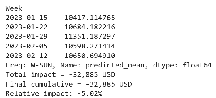
We see a negative impact of $32,885, about 5% of projected annual turnover.
Now lets plot:
1
2
3
4
5
6
7
8
9
10
11
12
13
14
15
16
17
18
19
20
21
22
23
24
import matplotlib.pyplot as plt

fig, ax = plt.subplots(figsize=(12, 5))

# Counterfactual only for post-change period
ax.plot(cf_mean, label='Counterfactual (no change)', linestyle='--')

# Actuals
ax.plot(y, label='Actual revenue', linewidth=2)

# Vertical line at change date
ax.axvline(change_date, color='blue', linestyle=':', linewidth=1)
ax.text(change_date, ax.get_ylim()[1],
        '  Change\n  introduced',
        va='top', ha='left')

ax.set_title('Actual vs. Counterfactual Revenue')
ax.set_xlabel('Week')
ax.set_ylabel('Revenue')
ax.legend()
ax.grid(True, alpha=0.3)

plt.tight_layout()
plt.show()
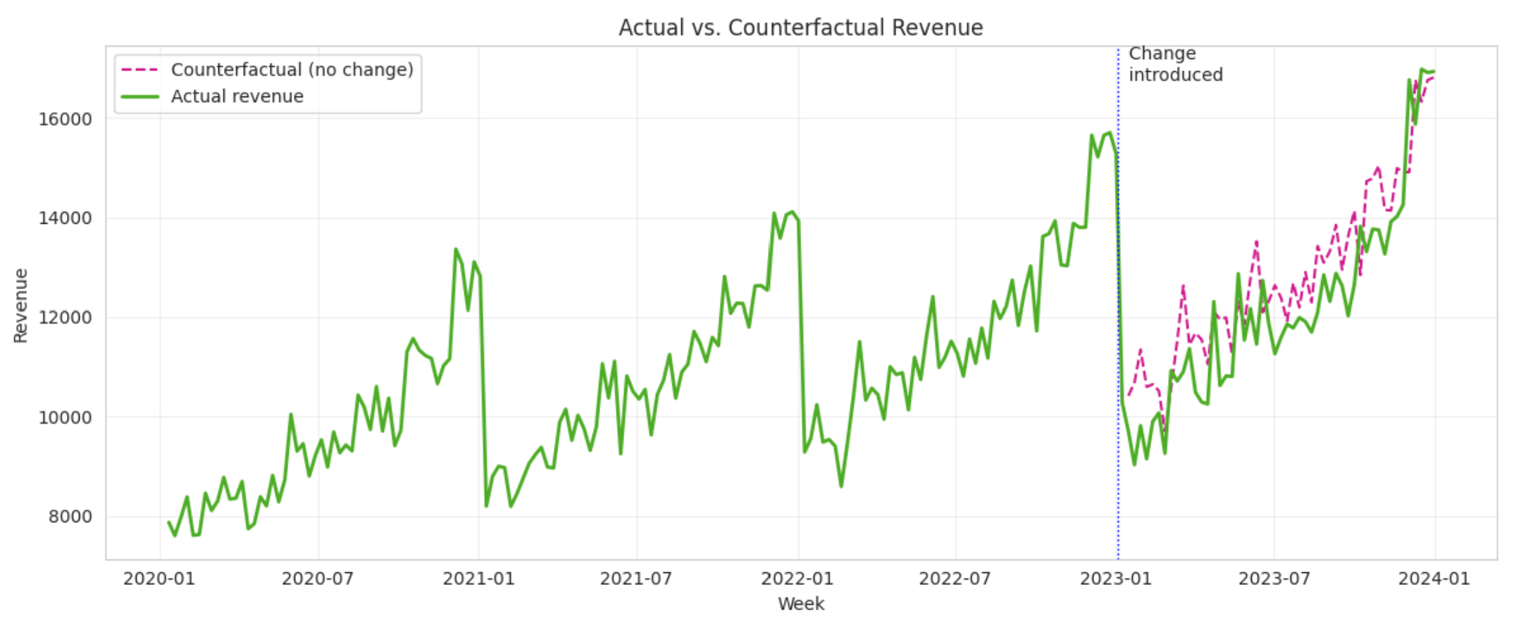
We can clearly see that the counterfactual projection sits above the actual figures - the dashed pink line stays almost entirely above the green line.
Important Note: The negative effect of -$32,885 (-5%) does not mean our revenue fell by $32.8K or 5%. It means that had we not made the price change, our revenue would have been $32.8K (5%) higher than what we actually observed in the post change period.
Model Results: Conclusion
We can now apply the same procedure we used for Revenue to our Quantity metric as well. Don’t worry, I’ve already done it for you and uploaded the full notebook to my GitHub repository. Here’s a summary of the results:
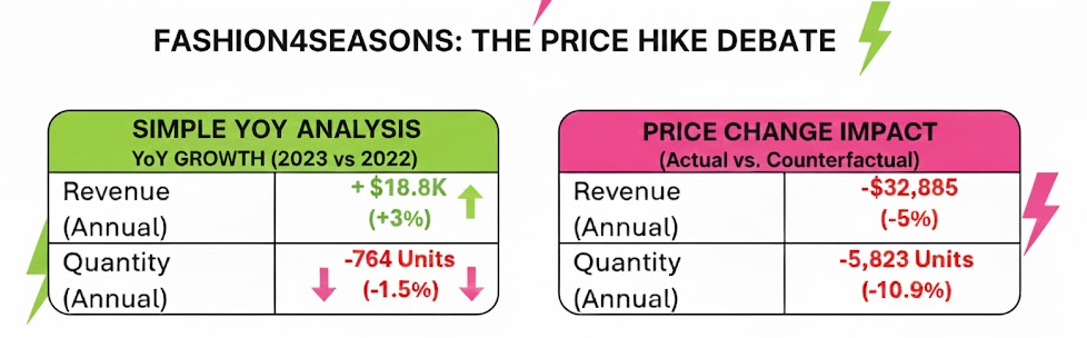
In our example, the YoY ‘positive’ result is misleading because it doesn’t account for the organic growth that would have occurred anyway.
SARIMA Successes Where CausalImpact Fails
Another way to measure impact is by using CausalImpact (a Bayesian structural time-series method that estimates what would have happened in the absence of an intervention, using control variables). The challenge is that CausalImpact relies on several strict assumptions and data conditions.
Earlier in this article, I outlined multiple business realities that naturally push us toward a counterfactual time-series model. Under those conditions, it is highly unlikely that the prerequisites for a reliable CausalImpact model are met.
Let’s see how CausalImpact performs on our dataset:
1
2
3
4
5
6
7
8
9
10
11
12
13
14
15
16
17
18
19
20
21
22
23
24
25
26
27
import pandas as pd
import numpy as np
from causalimpact import CausalImpact

data = df[["Revenue"]].copy()
data.columns = ["y"]   # CausalImpact expects column name "y"

# Define pre- and post-periods
# Intervention == first Sunday of 2023
change_date = pd.Timestamp("2023-01-01")

# Pre-period ends on the last observation before Jan 1, 2023
pre_period  = [data.index[0], change_date - pd.Timedelta(days=7)]

# Post-period begins on first observation after Jan 1, 2023
post_period = [change_date, data.index[-1]]

print("Pre-period: ", pre_period)
print("Post-period:", post_period)

# Run CausalImpact
impact = CausalImpact(data, pre_period, post_period)

# Output results
print(impact.summary())
print("\n\n----- FULL REPORT -----\n")
print(impact.summary(output='report'))
Results
CausalImpact estimates a positive effect of 2.81% to 13.02% (95% CI). Why does it think the price increase helped?
- Revenue in 2023 is higher than in 2022 simply because the whole market is trending upward. CausalImpact sees this and concludes: “The intervention increased revenue!”
But that’s not the question we care about.
We’re not asking “Did revenue go down?” We’re asking: “How much higher would 2023 have been if we hadn’t raised prices?”
That’s a relative loss, not an absolute drop.
- No valid control series. CausalImpact requires at least one predictor that behaves like Revenue before the intervention and remains unaffected afterward. We don’t have such a control - and in many business settings, we never do. Without a clean control, CausalImpact falls back to modeling the structural trend and mistakenly interprets “normal growth” as a “positive causal effect.”
Conclusion
This case shows how predicting the present with time-series models can reveal the true, counterfactual impact of business changes when controlled experiments are impossible. A simple YoY comparison would have falsely suggested a positive outcome. The SARIMA counterfactual revealed the real story: the price change created a 5% revenue shortfall, despite a growing market.
This approach is broadly applicable: pricing decisions, product launches, platform migrations, incentive changes, feature removals - any action where you must estimate the impact on a world you cannot observe.
GitHub repository: dataset + full notebooks
Originally published on Medium.