Based on a True Story Case 1 - Defining Churn with SQL in a Usage-Based Company
No ML, no black box - just structured logic, decision thresholds, and a clean SQL solution.
What We’ll Cover
- The business problem of defining churn in usage-based companies
- How to build a SQL-based model to identify churn thresholds with known error rates
- A deep dive into the
LAG()window function and its arguments - Dodging survival bias by choosing the right population
The case you’re about to read is inspired by actual events that happened in a real usage-based tech company. Certain field names and operational details have been altered to protect sensitive information. Any resemblance to a real business case is not coincidental - because it is one.
This was a real BI challenge, solved with business understanding, structured problem solving, and technical execution.
The Industry Blind Spot
Churn is an obsession for most companies - and for good reason. Entire teams build machine learning models to predict churn before it happens, set up alerts and campaigns to re-engage customers on the brink, and track KPIs and OKRs designed to reduce churn rates. And they’re absolutely right to do so.
But before any of that can work, a business must answer a deceptively simple question:
What does it actually mean for a customer to churn?
In SaaS, the answer is straightforward: the customer doesn’t renew their subscription. In banking, it’s when the customer closes their account. Clear. Binary. Easy to measure.
In many usage-based businesses, knowing when a customer churns isn’t trivial. There’s no cancellation button, no explicit signal, just silence.
But silence isn’t the same for everyone. Some transact daily. Others monthly. The challenge: how do we define churn reliably when the clock ticks differently for every customer?
Three months into the job, I was tasked with defining the moment when a customer should be declared churned - something critical for revenue forecasting, retention KPIs, and marketing triggers.
There was no playbook. So I built one.
The key insight was simple: a customer’s churn window isn’t fixed - it’s relative to their usual transaction rhythm. So instead of guessing, I measured, for each frequency segment, how long customers typically ‘disappear’ before returning. That gave us data-backed thresholds for declaring churn with known error rates.
The methodology was packaged into a clean SQL query and a Power BI dashboard showing cumulative return curves per frequency segment. The result: a churn identification layer the entire company could rely on.
And the potential business benefits are clear:
- Earlier retention interventions: act before customers fully lapse, not after.
- Sharper targeting: segment customers by actual behavior, not guesswork.
- More accurate forecasting: improve revenue and churn predictions with measurable error rates.
- Better ROI on marketing: focus reactivation and retention resources where they’re most likely to pay off.
How It’s Done
Step 1: Transaction Frequency Categories
Usage-based companies serve customers with very different transaction patterns. Take Wolt or DoorDash, for example:
- Some order lunch to the office every weekday
- Others only on weekends
- Some just once every few weeks
If a daily user stops ordering for a week or two, that’s a red flag. For a monthly user, two weeks of inactivity means nothing.
In many companies, transaction frequency is already classified by data engineering or data science, but if not, here’s a simple SQL CTE to build it yourself. Just make sure to adjust the thresholds to fit your company’s usage patterns.
1
2
3
4
5
6
7
8
9
10
11
12
13
14
15
16
17
18
19
20
21
22
23
24
25
26
27
28
29
30
31
32
33
34
35
36
37
38
39
40
41
42
43
44
45
46
47
48
49
-- Creating a table with transactions, date and the date of the previous transaction

WITH Lags_Dates AS (
    SELECT
        Customer_ID,
        Transaction_ID,
        Transaction_Date,
        LAG(Transaction_Date) OVER (
            PARTITION BY Customer_ID
            ORDER BY Transaction_Date
        ) AS Prev_Transaction_Date
    FROM Transactions
),

-- Translating dates to interval in days

Lag_Days AS (
    SELECT
        Customer_ID,
        Transaction_ID,
        DATE_DIFF(Transaction_Date, Prev_Transaction_Date, DAY) AS Lag_Days
    FROM Lags_Dates
    WHERE Prev_Transaction_Date IS NOT NULL
),

-- Average lag grouped by Customer

AVG_Lag AS (
    SELECT
        Customer_ID,
        AVG(Lag_Days) AS Avg_Lag_Days,
        COUNT(Transaction_ID) AS Num_Transactions
    FROM Lag_Days
    GROUP BY
        Customer_ID
)

-- Final classification (with buffers)
SELECT
    Customer_ID,
    Num_Transactions,
    CASE
        WHEN Avg_Lag_Days <= 2  THEN 'Daily'
        WHEN Avg_Lag_Days <= 10 THEN 'Weekly'
        WHEN Avg_Lag_Days <= 25 THEN '2-3 Per Week'
        WHEN Avg_Lag_Days <= 35 THEN 'Monthly'
        WHEN Avg_Lag_Days <= 40 THEN 'Occasional'
    END AS Customer_Type
FROM AVG_Lag;
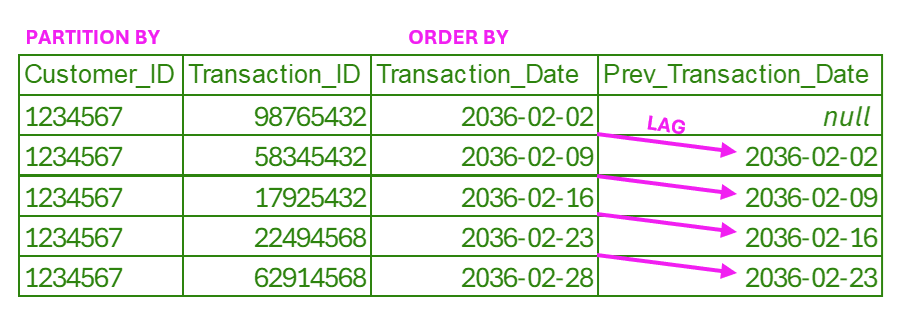
Here, and again in the following step, we use the LAG() window function, which allows us to look back at the previous row’s value and add it to the current row as an additional column.
PARTITION BY Customer_IDensures the lookback happens only within each customer’s transactions (no mixing between customers).ORDER BY Transaction_Datedefines the sequence in which the function looks back (previous means the transaction with the earlier date).LAG(Transaction_Date)then copies the previous date forward into thePrev_Transaction_Datecolumn.
Step 2: Main Query
We have a Lag_Days table that looks like this:
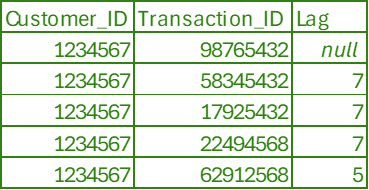
We will use our Lag_Days to:
- Identify for each customer their maximum inactivity gap.
- Group customers by
Customer_Typeand Max Lag Days. - Compute cumulative counts and percentages to produce a lag distribution curve.
1
2
3
4
5
6
7
8
9
10
11
12
13
14
15
16
17
18
19
20
21
22
23
24
25
26
27
28
29
30
31
32
33
34
35
36
37
38
39
40
41
42
43
44
45
46
47
48
49
WITH Base_Table AS (
    SELECT
        Customer_ID,
        Customer_Type,
        MAX(Lag_Days) AS MAX_Lag_Days
    FROM Lag_Days
    GROUP BY
        Customer_ID,
        Customer_Type
),

-- Count how many customers belong to each (Customer_Type, MAX_Lag_Days)
Aggregated AS (
    SELECT
        Customer_Type,
        MAX_Lag_Days,
        COUNT(*) AS Customers_in_Group
    FROM Base_Table
    GROUP BY
        Customer_Type,
        MAX_Lag_Days
),

-- Compute cumulative counts and totals
Cumulative_Count AS (
    SELECT
        Customer_Type,
        MAX_Lag_Days,
        Customers_in_Group,
        SUM(Customers_in_Group) OVER (PARTITION BY Customer_Type ORDER BY MAX_Lag_Days) AS Cumulative_Count,
        SUM(Customers_in_Group) OVER (PARTITION BY Customer_Type) AS Total_in_Type
    FROM Aggregated
),

-- Final calculation of percentages
Percentages AS (
    SELECT
        Customer_Type,
        MAX_Lag_Days,
        Customers_in_Group,
        Cumulative_Count,
        Total_in_Type,
        Cumulative_Count * 1.0 / Total_in_Type AS Cumulative_Percentage,
        1 - (Cumulative_Count * 1.0 / Total_in_Type) AS Frequency_in_Population
    FROM Cumulative_Count
)
SELECT *
FROM Percentages
ORDER BY Customer_Type, MAX_Lag_Days;
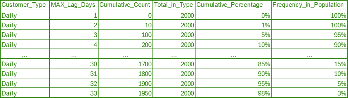
The output is a lag distribution curve per customer type, ordered by customer type and lag days:
Or, on a decay curve:
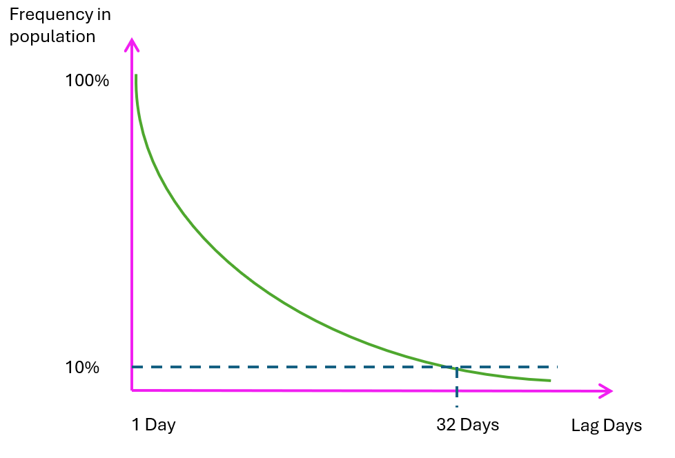
What do the chart and the decay curve tell us?
Let’s look at Max Lag Days = 32. Only 10% of daily customers experienced a 32-day break and then returned. This shows that such long inactivity periods are relatively rare.
This 10% figure is not an error or accuracy bound. It simply reflects rarity. The upper bound of potential misclassification is the entire tail beyond 32 days - because everyone past that point would be flagged as churned, even though some eventually return.
- ≥ 32 days → 10% maximum false positives if everyone in the tail returns.
> 32days → 5% maximum false positives.
In most real-world datasets, the difference between ≥ and > is much smaller than this toy example.
Moving the Model Forward: Drawing a Line in the Sand
What we’ve built so far is already a strong, thoughtful solution. By mapping lag distributions, reading the decay curve, and identifying behavioral inflection points, we’ve created a clear, data-driven lens on inactivity - something far beyond typical BI churn definitions.
But if we want to take it one step further, we can introduce an operational cutoff. In this example, we use 180 days. The exact number should reflect your own usage cycles and retention dynamics.
“No matter what threshold we work with for analysis, we can simply declare anyone inactive for 180 days as churned.”
This isn’t about replacing what we’ve built - it’s about giving it an optional ramification: turning descriptive insights into something that behaves more like a classification model.
This doesn’t replace our descriptive model - it extends it:
- Adds measurable false negatives (how many return after being flagged).
- Separates retention from reactivation strategies.
- Makes the model sharper, more explainable, and more actionable.
And let’s be honest - if we don’t draw this line, someone in the business will.
If someone ghosts you for six months, you don’t call it a relationship. You call it history.
What logic should we apply to do that?
Let’s take Daily customers as an example, with the churn threshold set at 32 days.
- Numerator (False Positives): Count all customers whose
Max_Lag_Daysis between 32 and 179. These are customers who would be flagged as churned at 32 days but actually returned before the 180-day cutoff. - Denominator (Flagged Population): Count all customers whose
Max_Lag_Daysis greater than or equal to 32. This includes both false positives (returned before 180 days) and true positives (never returned after 180 days).
This tells us the probability of misclassifying a customer as churned at 32 days, when according to our operational definition (180 days) they are not actually churned.
The snippet below shows how to create different thresholds for different types of customers (‘Daily’, ‘Weekly’ and so on), and check error probabilities for each threshold, at a cutoff of 180 days, which flags a customer as “certainly dead”.
Just make sure to adjust the threshold definitions to match your company’s specific usage patterns and business needs, using the Cumulative_Percentage or Frequency_in_Population results from the earlier step as a guide:
1
2
3
4
5
6
7
8
9
10
11
12
13
14
15
16
17
18
19
20
21
22
23
24
25
26
27
28
29
30
31
32
33
34
35
36
37
38
39
40
41
42
43
44
45
46
47
48
-- Build the per-customer max gap
WITH Base_Table AS (
  SELECT
    Customer_ID,
    Customer_Type,
    MAX(Lag_Days) AS Max_Lag_Days
  FROM Lag_Days
  GROUP BY Customer_ID, Customer_Type
),

-- Add type-specific thresholds
With_Thresholds AS (
  SELECT
    *,
    CASE Customer_Type
      WHEN 'Daily' THEN 32           -- Threshold for Dailies
      WHEN 'Weekly' THEN 60          -- Threshold for Weeklies
      WHEN '2-3 Per Week' THEN 70    -- Threshold for 2-3 Per Week
      WHEN 'Monthly' THEN 80         -- Threshold for Monthlies
      WHEN 'Occasional' THEN 100     -- Threshold for Occasionals
    END AS Threshold
  FROM Base_Table
),

-- Calculate error stats per type
ErrorPerType AS (
  SELECT
    Customer_Type,
    Threshold,
    -- A: crossed threshold but not 180 → false positives at T
    SUM(CASE WHEN Max_Lag_Days >= Threshold AND Max_Lag_Days < 180 THEN 1 ELSE 0 END) AS False_pos,
    -- B: crossed 180 → true positives at T
    SUM(CASE WHEN Max_Lag_Days >= 180 THEN 1 ELSE 0 END) AS True_pos,
    -- N: everyone who crossed threshold
    SUM(CASE WHEN Max_Lag_Days >= Threshold THEN 1 ELSE 0 END) AS Flagged
  FROM With_Thresholds
  GROUP BY Customer_Type, Threshold
)

SELECT
  Customer_Type,
  Threshold,
  False_pos,
  True_pos,
  Flagged,
  False_pos * 1.0 / Flagged AS Error_at_T_inclusive
FROM ErrorPerType
ORDER BY Customer_Type;
And the output will look like this:

Why Set a Threshold Earlier Than 180 Days?
You might ask: “Why bother with thresholds at all? We already have a 180-day churn definition. We know who’s churned.”
That’s true, but the 180-day cutoff is a diagnostic definition, not a response strategy. It tells you when someone is officially gone, not when they start slipping away.
By setting a lower threshold, one that reflects the maximum acceptable error rate we can live with, we can flag customers earlier, before they reach the official churn point.
And that opens up several business advantages:
- Earlier retention campaigns - reach them while they’re still warm.
- Tighter ML models - earlier flags = stronger signals.
- Shorter reaction time - more recoverable users.
- Better ROI - resources focused on at-risk customers, not lost ones.
The threshold is your business dial: how early you act vs. how much error you can tolerate.
Choosing the Right Population: Dodging Survival Bias
To get meaningful signals, we must choose the right population. Cohort selection matters. A lot.
Anchor your analysis by registration date or first transaction date, not last activity date.
If you select by last transaction date, you’re only picking survivors. That:
- Filters out churned customers
- Overrepresents loyal ones
- Shortens lag distributions artificially
- Underestimates churn
- Lowers measured error rates
Cohort selection ensures everyone had the same opportunity window, giving you the real shape of churn - not just the happy endings.
Further enhancement in a real world model
The model presented here is a simplified example - a clean code skeleton designed to illustrate a business concept, not a production-ready solution.
In real life, you’ll inevitably face messier data, specific business logic, and customer behaviors that require additional layers of nuance. Once you’re working with your own usage patterns and cycles, here are a few practical enhancements and ramifications worth considering:
1. Stricter definitions of “activity”
Not every transaction should count as “being active.” You can define activity only when it exceeds a certain monetary threshold, volume, or duration - depending on your business.
This avoids mistakenly treating insignificant events as reactivation.
For example: Think of someone who used the freemium version of Duolingo intensively before a trip abroad, stopped completely afterward, then randomly opened it once or twice for a minute before abandoning it for good. Without a threshold, those one-off “pings” would pollute your reactivation signals and create noise in your churn model.
2. Translating intervals in days into “Cycles”
Instead of working purely with raw days, you can normalize intervals into customer usage cycles.
- For a daily user, 1 cycle = 1 day.
- For a weekly user, 1 cycle = 1 week.
- For a monthly user, 1 cycle = 1 month.
This allows you to apply a common threshold across different customer types, making your model more robust and interpretable.
1
2
3
4
5
6
7
8
9
10
11
12
13
SELECT *,
CASE
    WHEN Customer_Frequency = 'Weekly' THEN
        ROUND(DATEDIFF(DAY, Transaction_Date, Prev_Transaction_Date) / 7, 0)
    WHEN Customer_Frequency = 'Daily' THEN
        ROUND(DATEDIFF(DAY, Transaction_Date, Prev_Transaction_Date), 0)
    WHEN Customer_Frequency = '2-3 Per Week' THEN
        ROUND(DATEDIFF(DAY, Transaction_Date, Prev_Transaction_Date) / 20, 0)
    WHEN Customer_Frequency = 'Monthly' THEN
        ROUND(DATEDIFF(DAY, Transaction_Date, Prev_Transaction_Date) / 30, 0)
    ELSE NULL
END AS Cycles_From_Prev_Transaction
FROM Lags_Dates;
3. Setting a minimum number of transactions
It’s also wise to set a floor for customer activity before including users in this analysis. For example, you might require a minimum of 5, 10, or 15 transactions (depending on your business dynamics).
4. Seasonality adjustments
Inactivity isn’t always churn - sometimes it’s summer. Account for holidays, fiscal periods, or expected off-peaks to avoid false alarms.
Bottom line: these adjustments won’t change the conceptual core of the model - they’ll make it closer to production-grade, better aligned with your actual business, and less prone to noise and misleading signals.
Originally published on Medium.