Range Against the Machine Case 1 - The Model That Outsmarted AutoML Because it Understood the Neighborhood
Before getting down to business with model building, I took a step back to reflect on the business.
Using Principal Component Analysis (PCA) as a quick pause to explore the urban market dynamics behind the principal components and applying business reasoning before doing any modeling laid the groundwork for feature engineering that’s more than just math.

Recently, I was officially assigned by the Massachusetts Institute of Technology to re-examine the Boston Housing dataset in light of emerging ML technologies. (Yes, I deserve a career in branding or PR just for phrasing it like that - but technically, it’s true.)
“Making predictions is hard, especially about the future” they say - so I didn’t mind when they asked me to make predictions about the past.
Originally published in 1978 by the US Census Bureau, the Boston Housing dataset was used to study how various factors influence housing prices in Boston suburbs and accidentally became the go-to playground for generations of statisticians, econometricians, and machine learning wannabes.
In my cover version of this oldie-but-goodie standard, I mix a bit of PCA with some common business-domain knowledge - the kind everyone has but rarely uses in data science - to improve feature engineering.
This approach helped me avoid the well-trodden “drop TAX because of VIF” gambit that dominates other covers on GitHub and Kaggle. That usual path leads predictably to the inevitable backward elimination cascade:
- drop INDUS because of insignificance
- drop AGE because of insignificance (Wait what? Shabby neighborhoods aren’t predictive of house prices?)
- and finally, drop ZN because of insignificance.
That textbook route tends to yield a model with ~73% R² in multiple linear regressions.
In my alternative remix, I salvage AGE (because there are no bad features, only badly handled ones), and squeeze more juice out of powerful independent variables - earning a few extra drops of R² and milder prediction errors.
Using PCA
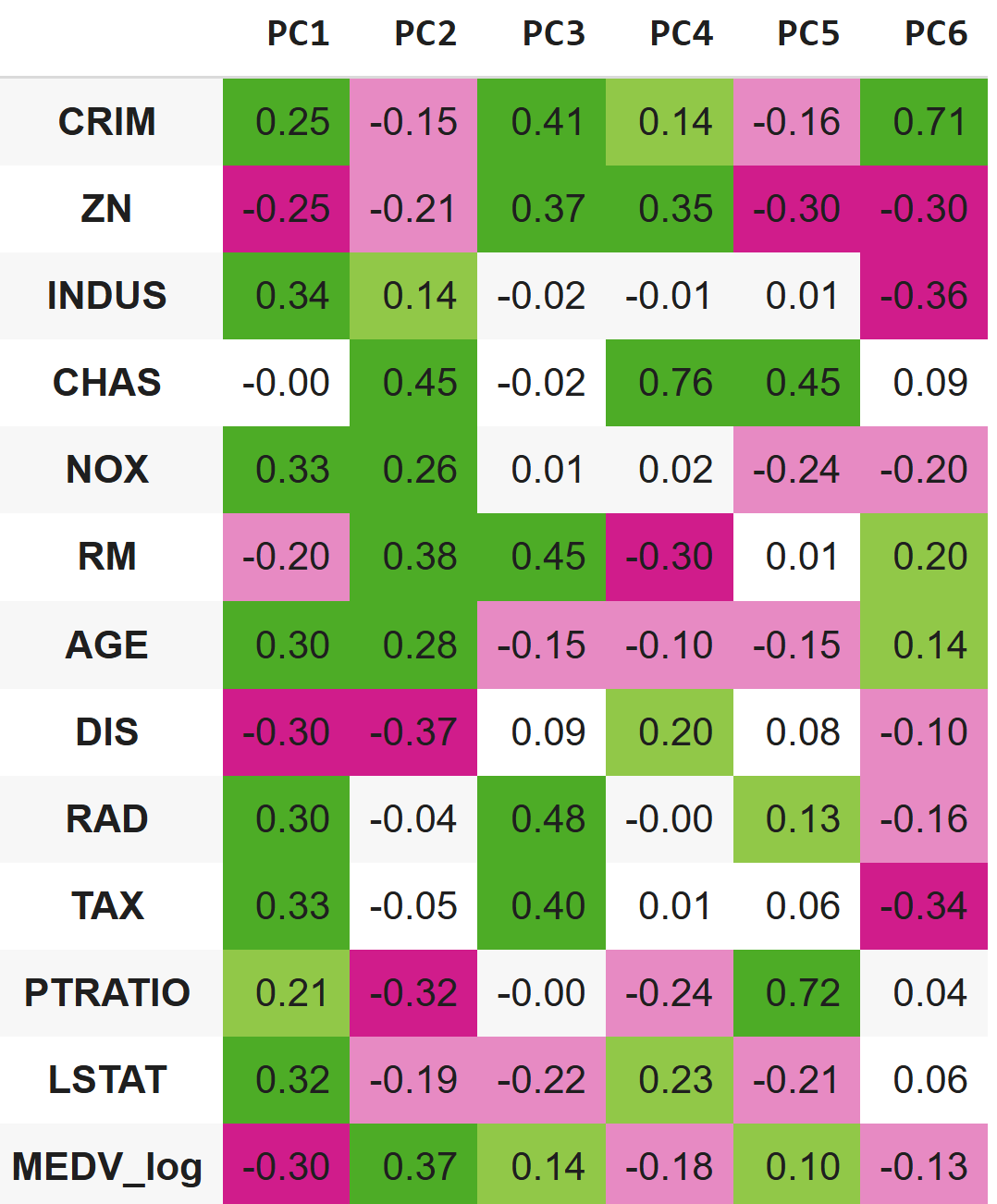
In our dataset, PCA helps identify features consistently associated with high housing prices along the main axes of variation. These features can then be broken down to reveal nonlinear patterns, which are used to engineer more informative predictors. This approach was necessary to enhance the model’s performance under a key constraint set by the Massachusetts Institute of Technology: the exclusive use of multiple linear regression. Feature engineering, therefore, became the primary tool for capturing complex relationships within the limits of a linear framework.
It also helps us spot features whose relationship with price isn’t consistent - features that behave differently across axes. Some of these may turn out to be better suited as classifiers. I argue that many of these different behaviors of features along the axes are caused by residential market dynamics we all intuitively familiar with. Let’s have a look!
PCA-Aided Feature Engineering
In this section I’ll discuss how I used PCA as a diagnostic tool for feature engineering. The code applied for these transformations is not groundbreaking, so I chose not to interrupt the business reasoning with code snippets. For those of you who wish to dive deep into my shallow code, you are welcome to see the full code notebook that was used for this analysis.
Strong Monotonic Variables
Take RM and LSTAT, for example. Their relationship with housing prices is pretty monotonic across all major principal components. We’ll explore nonlinear transformations for them as well, just to squeeze out a bit more accuracy. For this reason, I centered them (subtracted the mean from each value) and squared them so the model could capture non-linear (U-shaped or inverted U-shaped) effects.
AGE
But then there’s AGE, which behaves… weirdly. On the first principal component, older buildings correlate with lower prices. On the second, it’s the opposite - older buildings associate with higher prices. And on the third, it flips again: newer buildings drive prices up. What’s going on here?
This is where some basic business common sense comes in. We all know that brand-new neighborhoods often have higher appeal. But we also know that some cities have historic areas - old buildings, yes, but sky-high prices. Think of places like Beacon Hill or the West End in Boston. Or, internationally: Montmartre in Paris, Notting Hill in London, Greenwich Village in NYC. Some were always central and strong; others were lifted by gentrification.
Using both the PCA output and some domain intuition, I can start distinguishing between two types of old neighborhoods:
- old, neglected, and cheap;
- old, desirable, and expensive.
LSTAT is monotonic with our target variable across the principal components - and that checks out. It captures socioeconomic concentration directly.
We all know from experience that young families often tolerate older housing if the local schools are strong. So PTRATIO also fits. It aligns well with the target variable across most PCs- 1 through 3, and 5 - even though PC4 shows a bit of noise.
So. for my classifiers, I’ll rely on LSTAT, PTRATIO, and my newly engineered AGE variable, that tells this story, that anyone that toured in a metropolitan can tell:
Sure, people would usually prefer modern housing and modern neighborhoods, but in some “historic” districts and gentrified areas, we still see strong demand that manifests itself in housing prices.
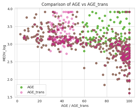
Figure 2: Age before and after transformation, we can see how the green cluster is now split to left high and right low, showing a clearer downward trend of price as AGE_trans goes up
Crime
CRIM, like AGE, is non-monotonic. On the second principal component, neighborhoods with low crime rates are associated with high housing prices - and the reason is straightforward.
But in our third principal component, we observe very high crime rates also associated with relatively high housing prices. In components 4 to 6, crime returns to correlate monotonically with our target.
What is going on?
Let’s look at what differentiates our two high-price PCs. In PC3, the first standout variable is ZN - this component is far more residential than PC2. We can also observe that PC3 reflects newer developments.
Even without pinpointing the exact nature of the cluster driving the PC3 variation axis, we can begin to tell a plausible story:
Low crime rates are typically associated with high housing prices (crystal clear, isn’t it?). But in some middle-class and upper-middle-class areas, which are relatively new and highly residential, we still see high crime rates - and yet, strong demand and a robust population.
On top of that we may add that not all crimes are alike; for example, house and car break-ins may be more common in middle-class and semi-gentrified areas, whereas crime patterns differ in poorer and downtown neighborhoods.
That’s enough signal to justify engineering the CRIM variable accordingly.
Note on CRIM and AGE engineered features: Bringing other strong variables as classifiers may overlap with parts of the signal that CRIM and AGE were originally carrying. That does introduce some redundancy. But I’m betting that the added clarity and stronger business rationale behind the transformed variables will justify it - even if it’s partially collinear, it now makes more sense and can play a distinct role.
From OLS to Ensemble – The Feature Engineered Model vs the Base Model Against the Machine
Linear Regression
These changes resulted in a more stable and accurate linear regression model. The feature-engineered model outperformed the base model on both key metrics: R² improved from 0.775 to 0.81, indicating better explanatory power and Mean Squared Error dropped from 0.151 to 0.133, showing lower average prediction error.
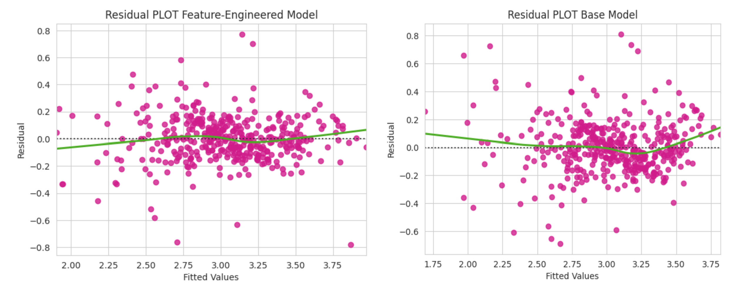
Figure 3: We can see a flatter LOWESS line compared to the base model that is U shaped, suggesting our non-linear transformed features are doing their job
A 10-fold cross-validation showed slightly jumpier R² in the feature-engineered model, however, the variance of error (± std X 2) is slightly reduced in the engineered model (±0.016 vs. ±0.018), suggesting a slightly more stable performance across folds.
Let’s SHAP
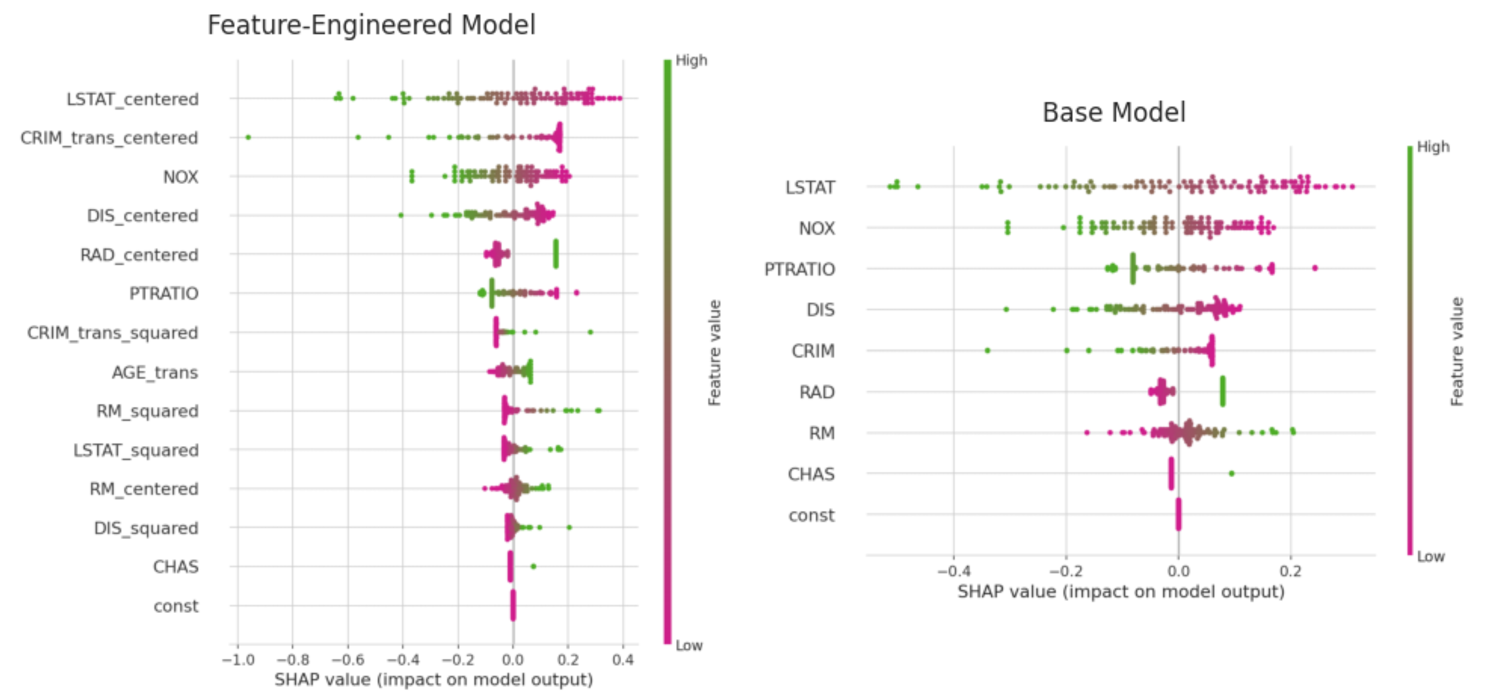
Figure 4: SHAP Plot for the linear regression model, not regularized
The SHAP plot shows that our transformation surfaced the hidden predictive power AGE, that is absent from the base model due to insignificance. Besides the humble contribution to the accuracy of the predictive power of the model itself, it adds more business clarity to the model.
Regarding the crime cluster, the transformation applied to crime increased its influence, making it the second most significant predictor, rising three spots compared to the base model. CRIM_trans_squared adds distinct nonlinear contributions, especially when CRIM is very high or very low these effects wouldn’t be captured by a linear term alone. This supports the initial assumption that people may avoid neighborhoods with high rates of violent crime but may be less deterred by middle-class neighborhoods with higher levels of non-violent property crime.
Regularization
We have seen that our independent variables (both engineered and non-engineered) can highly correlate with each other. A regularized model may help me squeeze some more R² from my data set and reduce overfitting at the same time (Although overfitting was marginal).
Now, here’s the thing about regularized models: they’re like a house party when the parents aren’t home. You can invite everyone, no limits. And if things get too loud, L1 and L2 are there to keep the noise just low enough so the neighbors don’t call the cops.
Armed with a range of alphas, and some formerly excluded features, I ran both sklearn’s RidgeCV and ElasticNetCV - both performed equally well.
Both train and test stood on R²=0.83 (ridge was 0.829 actually), with RMSE 0.167 on train and 0.175 on test. This means Ridge did the heavy lifting while Lasso stood on the sidelines and cheered. Why? I’d like to believe it’s because most features genuinely carry signal. May SHAP be my witness.
That is already considerably more than MLJar AutoML’s R²=0.78 for linear regression (with regularization under the hood) for this data set.
XGBoost and Ensemble
Encouraged by the results, I was ready for the next challenge: a nonlinear model. Although the Massachusetts Institute of Technology did ask for a linear model only, I was curious to see if my arsenal of engineered features can also compete against the machine in nonlinear models.
At this stage, I suspected that my custom transformations might start to lose their edge, after all, tree-based models like XGBoost can already capture nonlinear relationships without the need for squared terms. How did they perform then?
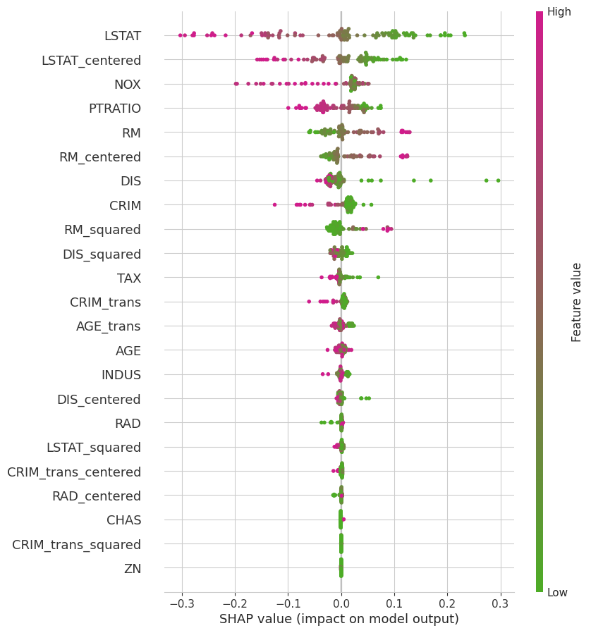
Figure 5: SHAP Plot for the XGBoost model: RM 2 and DIS 2 did capture nonlinear patterns that moved the needle. CRIM trans2 that performed well in the linear regression was almost completely redundant
Still, with careful manual tuning across a range of hyperparameters, I squeezed out an R² of 0.875 from XGBoost alone. Then, with a measured blend of 78% XGBoost for full-bodied predictive power and 22% of my finest Ridge, to balance the variable bouquet, I nudged performance up to R² = 0.8795 - just ahead of AutoML’s 0.877.
Sure, only true data connoisseurs might notice the nuance in a blind test.
But to me, the takeaway was richer: domain knowledge and business reasoning can rival, and sometimes outclass, raw AutoML horsepower.
Now we can predict much better the house prices in Boston Metropolitan 47 years ago…
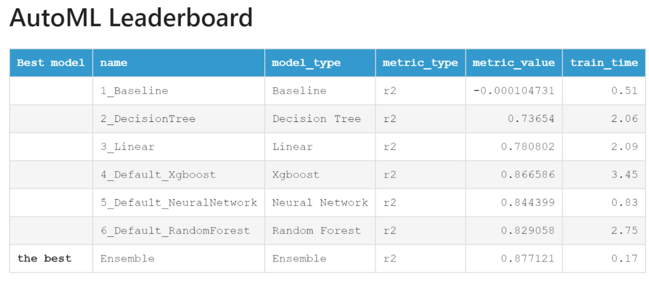
Figure 6: MLJar AutoML Leaderboard
From OLS to Ensemble: The Final Standings
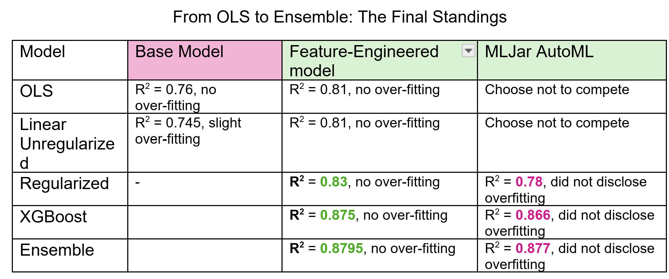
Figure 7: Model Comparison
One call to Uncle Marty in Boston and Bob’s your uncle
My curiosity about the urban dynamics of 1970s Boston wasn’t fully satisfied by R² scores and RMSEs. So, I called my Uncle Marty, a Bostonian in the past 6 decades.
I walked him through the segmentations and asked him for an example or two:
The high-crime, aging buildings, short distances, and low-income indicators immediately pointed to Roxbury, Dorchester, and parts of the South End. Spot on. These neighborhoods were known for small to medium-sized homes, high crime rates, and a largely low-income population - a textbook case of underinvested inner-city areas. The good news? Many of these neighborhoods, especially Dorchester, are now seeing the effects of gentrification.
Then came the tougher nut to crack: the cluster featuring high crime, large residential zones, big homes, and surprisingly high prices - the backbone of the PC3 axis of variation. Marty didn’t hesitate.
Waltham, in the late 1970s, was a blue-collar, suburban-industrial town in the midst of economic transition. Certain areas had elevated crime rates compared to wealthier suburbs. But Waltham also had extensive residential zoning, far less density than inner Boston, and, unlike the urban core, most of its hous ing stock was post-WWII. The rise of mid-century ranches, duplexes, and suburban infill explains the low AGE and high RM we see in the data.
Final Thoughts
Ultimately, the key to outperforming AutoML wasn’t just modeling power - it was perspective. Knowing that a feature has a signal is one thing. Knowing what that signal means is another. The machine may learn, but only we can experience and understand.
And with that, Bob’s your uncle.
** Important notes:
- The Boston House Prices data set is in the wild, with full variable descriptions
- I used the newer version that excludes the controversial B variable
- The target variable MEDV was transformed to log_MEDV, both in my notebook and in the file uploaded to MLJar